Say What You Want, As A Non-Designer I Love Bootstrap
 Bootstrap1 has been around for a number of years now. Open sourced by Twitter, its popularity grew so fast that it inspired a bit of reaction.2 And not without reason. Numerous websites took the bootstrap framework and slapped it on like the latest fashion trend. The result being a certain sense of sameness across the web. It’s only been five years, but it certainly seems like it has been around a lot longer than that. And bootstrap is still spreading out there. It’s added some new tricks during that time, and people are still pointing out the sameness spreading across more sites.3
And while I agree the public facing image of any business should be expressive of that company, I love to use Bootstrap. I am not a designer. I don’t think in CSS, except when I am trying to create Selenium locators. I also don’t build stuff that is the public face of any business. I make tools that are used by a limited set of people, and sometimes it’s just me. So originality in web design isn’t where I should be spending my efforts
Over the years I’ve used Bootstrap in a few places, and to good effect. My first use was to provide some new theming options to FitNesse4. They weren’t mandatory, but FitNesse was getting a bit dull and needed to get freshened up. And as a user, I found that classic side menu poor UI, so implementing a navbar that didn’t scroll out of site, made FitNesse easier to use. Bootstrap was easy to incorporate and it really did improve the experience (well, at least I thought so).
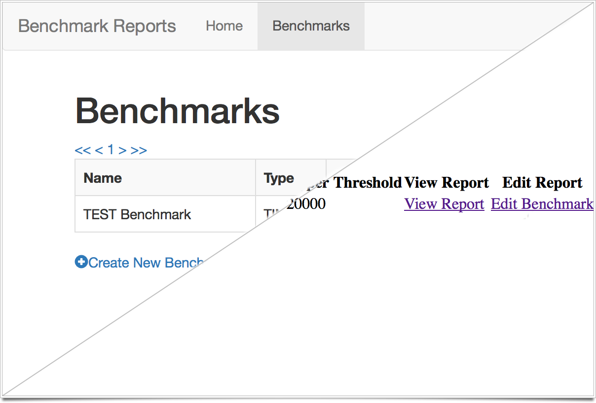
More recently I’ve been building tools for my own use and the team I work with. The first one was a tool that automated several queries and interactions with our test databases. I wrote the one in Sinatra5, another of my favorite tools, and incorporating bootstrap gave me a clean design that let me focus on getting the database and REST calls working. The second project, is a tool for benchmarking certain parts of our application and watching for big slowdowns. I’m currently building this tool in Wicket, as I don’t already know a Java-based web framework. And since I needed something to clean up the look of my HTML, I found and employed Wicket-Bootstrap6. Turning to Bootstrap again let me focus on learning how to build pages and interact with Wicket components rather than tweaking the cell-padding and other style attributes to get something I liked. Is it going to win a design award, no. But it will be functional and not super-ugly.
So, while I know that this causes a sense of “sameness” in the designs of these tools, using Bootstrap let’s me focus on what I need to do, which is build the tool. No one is employing me for my web design skills. We have excellent people at my company to do that, and they don’t need to spend their time styling a tool that will only be seen by internal employees. It may be a bit played out in the greater world wide web, but I’ll stick with bootstrap as a way to build tools faster with some decent styling.
Not everyone needs to build web-based tools in their day to day jobs. At one point I probably would have built tools like this in Visual Basic. I still write ruby scripts to automate tasks. Seriously, I even wrote some Perl recently. The point being, use the tool/mechanism that makes the most sense for what you need. And if you have to build a front end on your tool, don’t feel like you have to conquer styling it all from scratch. Swing by the getting started page for Bootstrap and figure out how to add it to your little web-based tool. Who cares if it looks a lot like twitter or a hundred other sites. It’s for you and your team, and it just needs to work.

